Samsung Galaxy S8 Is Here
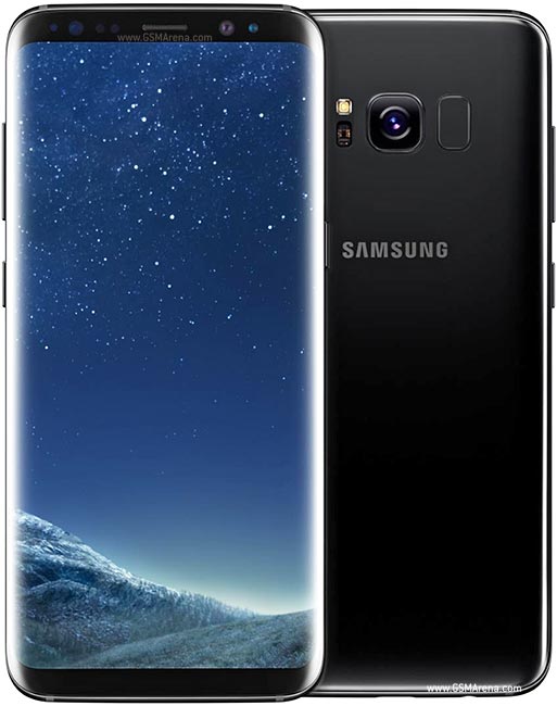
The Samsung Galaxy S8 was bombastically presented as the biggest design revolution in mobile phones since the iPhone. Samsung’s opening gambit was that handsets had morphed over the decades from huge bricks to flip phones to today’s rectangular smartphones, but moved on little in recent years. The S8, so the pitch goes, is the next era: big screens that break outside of the confines of the smartphone’s physical boundaries.
The S8 isn’t the equivalent of the leap from the flip phone to the iPhone. But it is an impressive feat of engineering: pushing the boundaries of how much real estate a screen can occupy in a device that fits in your pocket.

While the curved display has featured in previous Samsung phones, the S8 is clearly a step up: its front is so dominated by the screen that there is no room for a home button, or even the Samsung logo.
The S8’s standout statistic is 83.6 per cent, the phone’s screen-to-body ratio, which compares to 72 per cent for its predecessor the S7, and 65.6 per cent for the iPhone 7. It makes Apple’s phone look a little functional in comparison.
For my money, Apple’s operating system iOS is still superior to the Android software that the Galaxy S8 runs, but when it comes to design, Samsung is in the lead at this stage. The S8 is a glorious-looking device and photos don’t really do it justice. In person, people will coo over it.
The iPhone 7 has sold in record numbers, and remains the industry’s best phone on many fronts, but it hasn’t gone unnoticed that Apple has employed the same fundamental shape and size for three years running. Users are getting itchy for another breakthrough design.


